Using Analytics Panel To Inspect Real Estate Trends
 One of the first things I do when analyzing a new real estate deal is pull it up on the Investomation map to see the heatmap of the city it's located in. This heatmap lets me compare the neighborhood to other areas nearby and see if this neighborhood represents a local peak or valley in terms of demand. Additionally, by looking at multiple heatmaps, I can see the "shape" of the city, where are the wealthy areas and where are the problematic ones.
As far as metrics, I typically look at population growth, crime, jobs, income growth, and median rent. This helps me quickly figure out the neighborhood class and whether the deal will pencil out.
For example, if the rents are under $600, I'm probably going to lose money, even if the deal meets the coveted 2% rule. The maintenance costs and property management are going to eat up too much of my net revenue. Materials and maintenance still cost the same, regardless of which part of town I'm in. If anything, the wear and tear tends to be higher in poorer areas with more vandalism and tenant damage. Similarly, if the property is in a high-crime zone, I'm going to have a hard time finding tenants and keeping them, even if the rents are high.
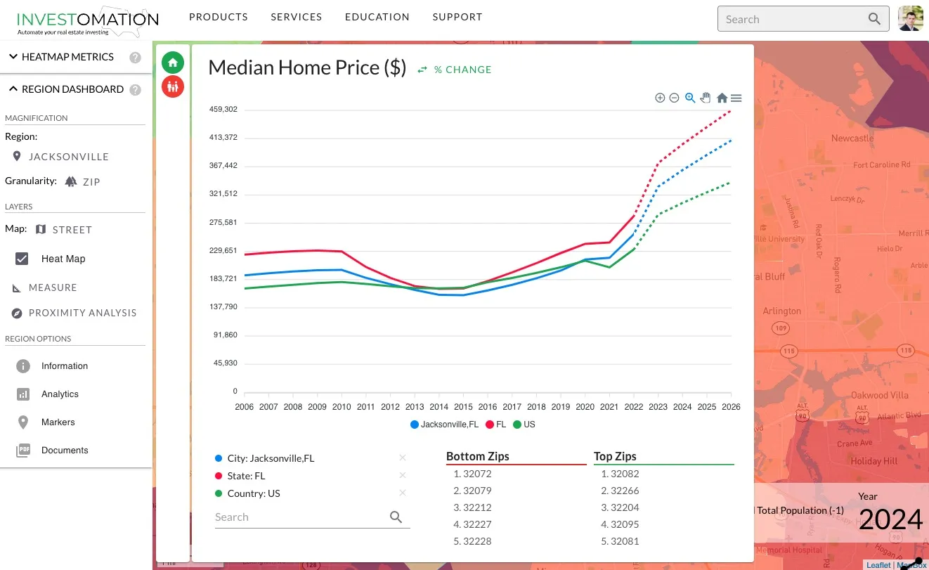
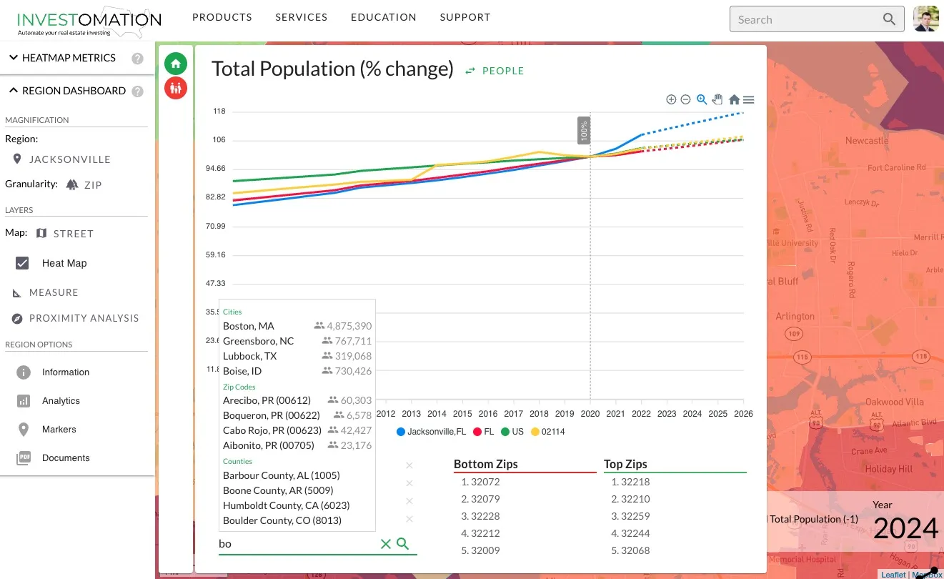
My next step is looking at trends. I want to see how the neighborhood has evolved over the last decade to gain an understanding of where it's going. I want to see population and job growth, as well as declining crime. And while it's possible to get a general idea of trends via delta metrics and the timeline, sometimes those tools aren't granular enough. For example, I can tell that the neighborhood is improving but not how that improvement compares to other areas. This is where the analytics panel comes in handy.
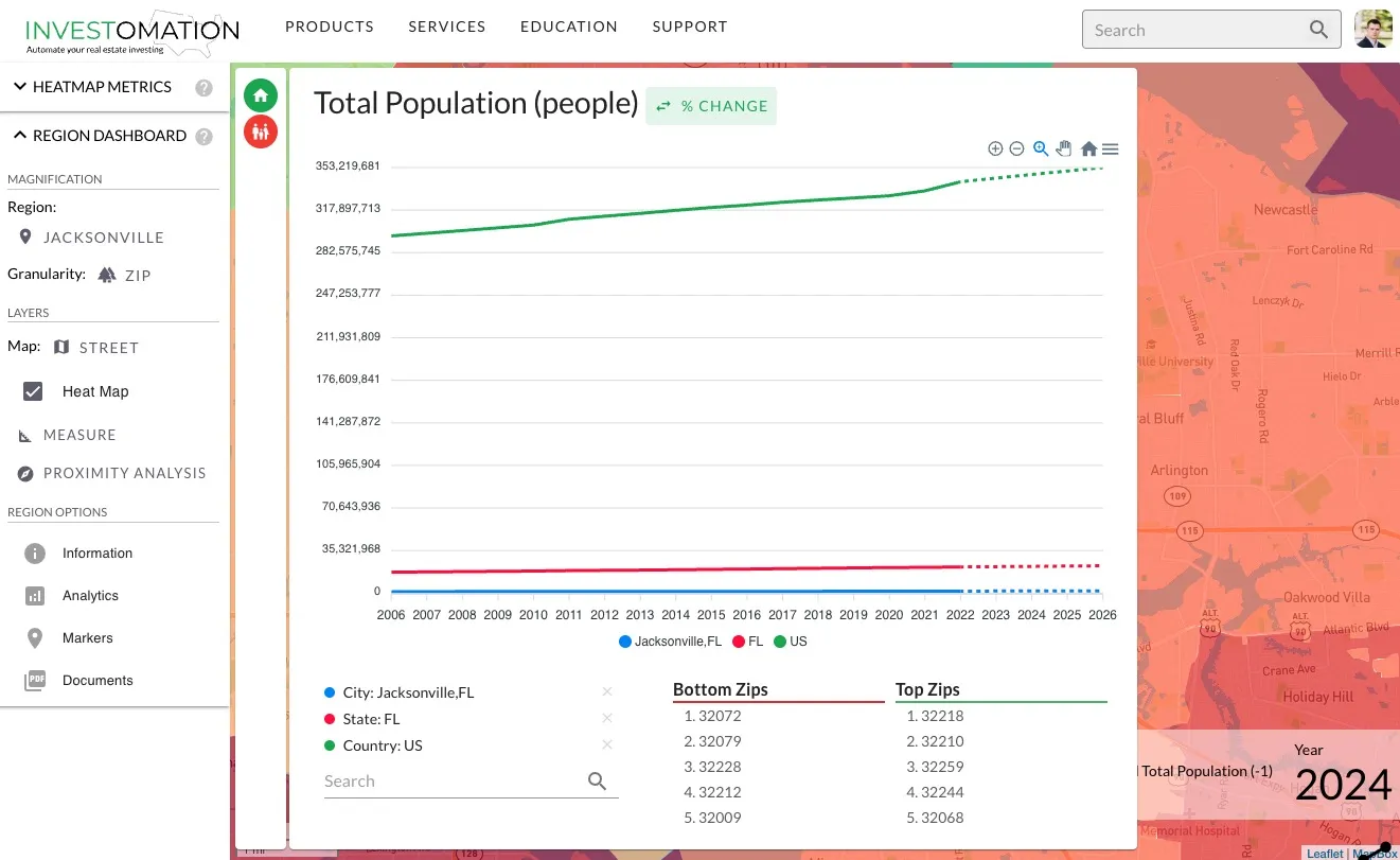
Analytics panel allows us to see a timeline for each of the metrics we've selected and compare it to other regions. Those regions could be other zip codes, tracts, counties, states, cities, or even the entire US. The panel automatically adjusts based on the currently selected region, even showing top and bottom performing granules within the area we're looking at.
However, as you can already see from the screenshot above, sometimes the difference in magnitude of the data is just too high to compare. This is where % change button comes in handy, allowing us to normalize the data to percent-based growth rather than raw numbers.
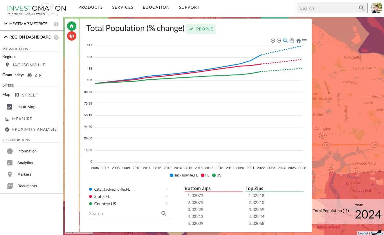
Once the data is normalized, it's clear that Florida has been seeing a faster population growth than the rest of the US, even before all the Californians started moving there in the last few years.
Selecting an individual year from the panel by clicking its label on the x-axis allows us to designate that year as the base year, normalizing the data to 100% and showing the percent change for each year relative to the base year. This can be very useful if we're focusing on a specific event (like COVID-19).
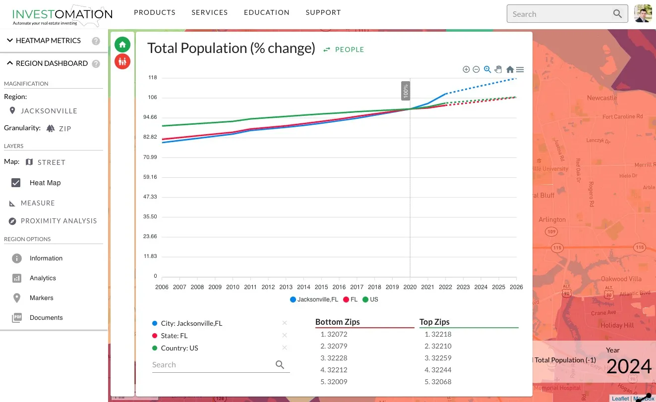
Once again, centering the data around 2020, we see that COVID-19 accelerated the population growth in Jacksonville, but did little to change the overall population trend in US (which makes sense, people moving from one state to another wouldn't change the population of the country). The analytics panel also allows us to overlay other regions on top of the current one simply by searching for them, and we can stack as many of them as we want:
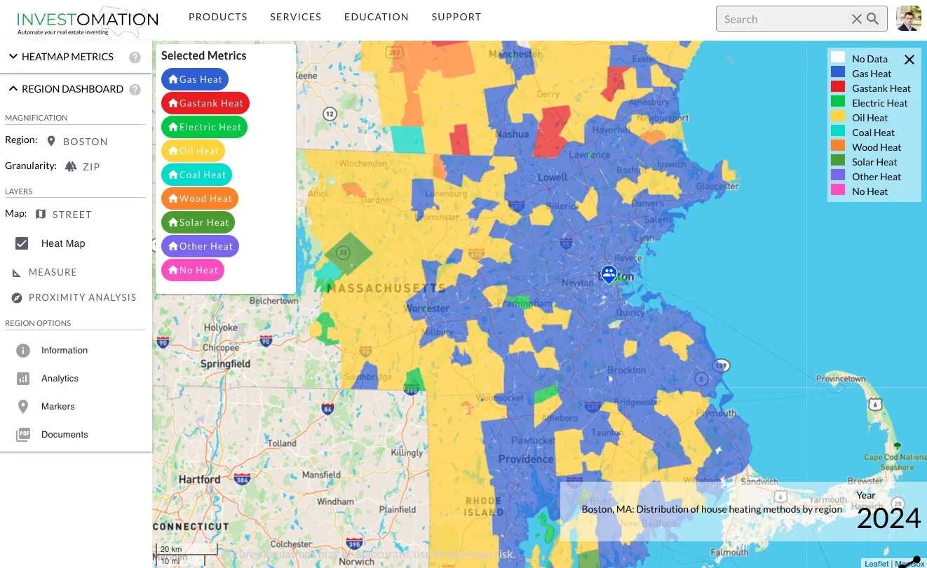
And we're not limited to rank-based metrics either. Investomation has a concept of categorical metrics, which are metrics that consist of multiple categories. The simplest version of these are gender ratios and polical party affiliations, which I already covered in another blog post. The more complex versions are race, ethnicities, businesses (which I covered in my post on NAICS codes), and many more. Selecting a categorical metric will populate the analytics panel with individual categories, such as the screenshot below showing the most popular housing heat sources by zip code in Greater Boston:
Selecting a category from this panel will spawn an analytics panel very similar to the one shown earlier:
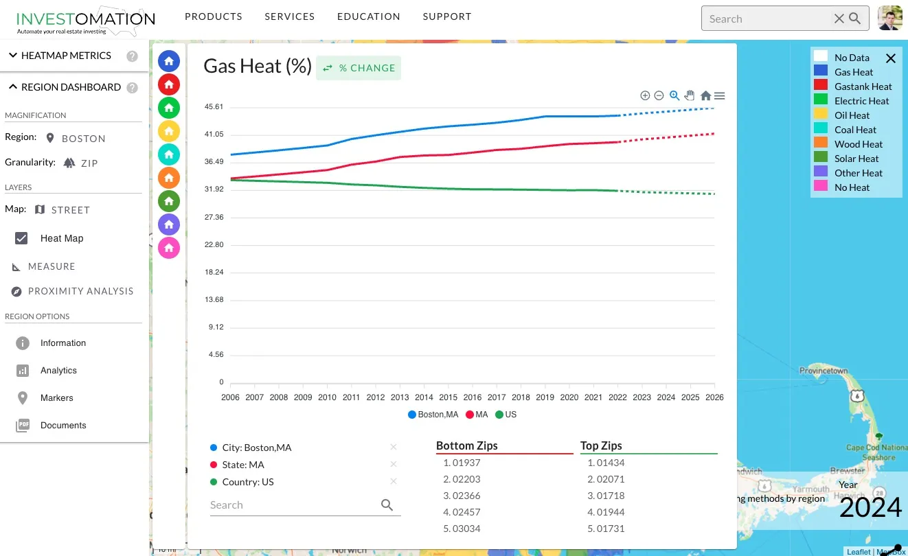
In this example we can see that the use of gas heat is steadily rising in Boston and Massachusetts over the last two decades (which makes sense as it's replacing oil that requires more maintenance and delivery by truck). However, across US as a whole, the use of gas heat seems to be declining (I'm not sure why, perhaps due to people slowly migrating to the southern portions of the US, where electric heat is more popular, causing more homes to be built there).
Anyhow, the point of this post is to show the use of analytics panel to compare trends between regions across time. While the analytics panel is already sufficiently useful, I do plan to beef it up further in the future to make it easier to compare trends between categories and different metrics, perhaps via a pie chart or a treemap. If you have ideas, feel free to comment below or reach out to me directly.